

DIGITAL INCLUSIVITY MATTERS
While Indigo’s National Equipment Database has been a go-to resource for many industry practitioners, listing over 10,000 assistive technology products, the team believed that more could be done for users to improve and streamline their marketplace experience. The website’s user experience had been in stasis for almost 10 years and NED itself didn’t have a distinct brand.
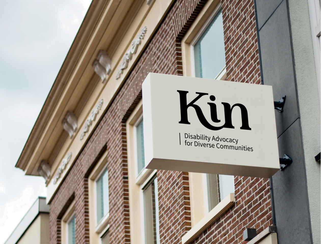
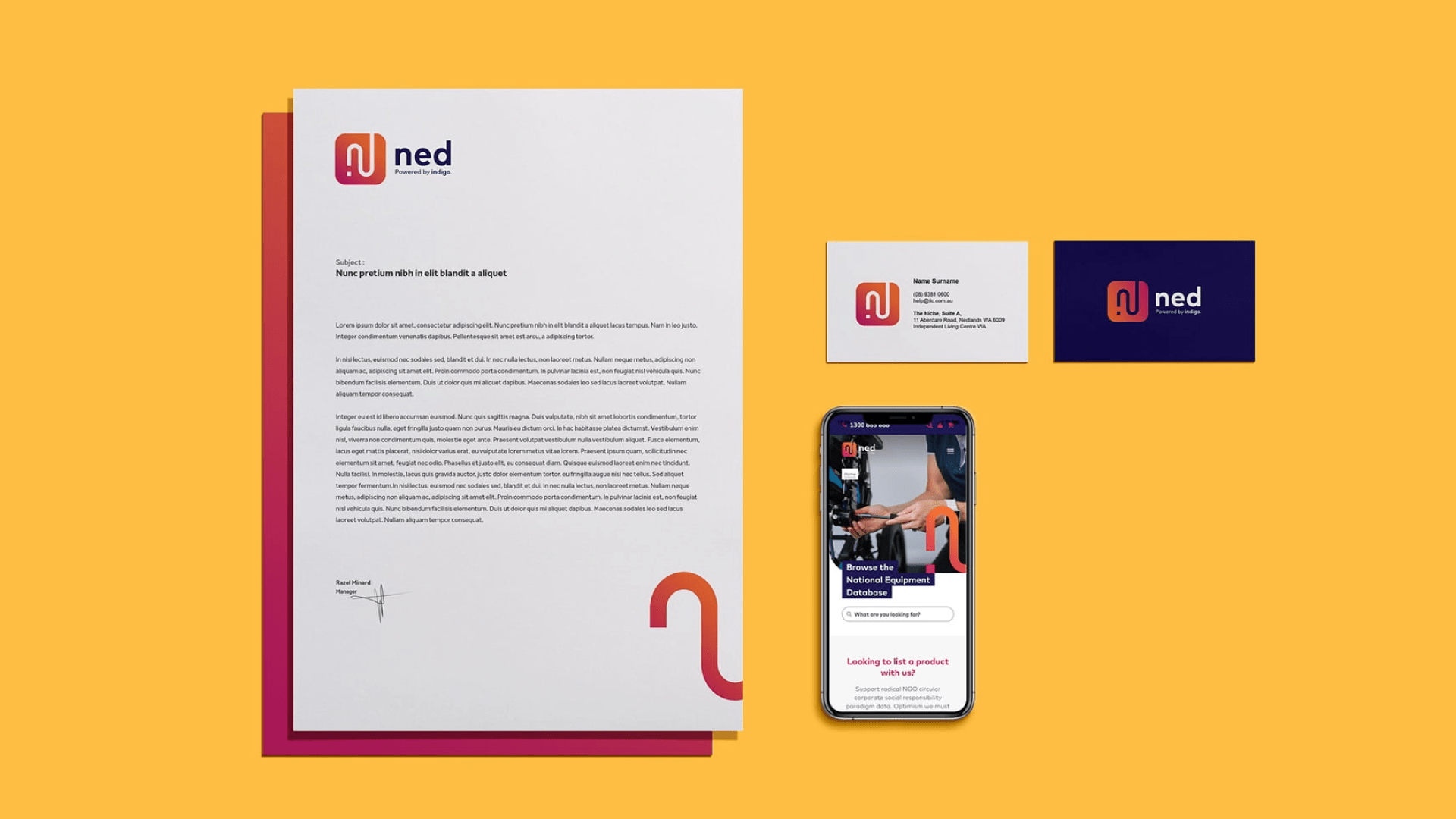
In years past, while NED was managed by Indigo, it was a shared national initiative that didn’t have its own identity in the market. As Indigo eventually inherited and took ownership of NED, the team identified a need to create and build equity for the database’s own brand.
We conducted half-day co-design workshops with Indigo’s working group, executives, communicators, and product managers, to understand the activities, behaviours needs and ambitions for NED. After multiple sessions with them, we learned and identified that while NED’s user experience needed to be rebuilt, it also needed to have a distinct, standalone identity to create equity in the industry. We were tasked to ultimately redesign the entire NED initiative online, including creating a brand strategy and developing an identity that would bring it in line with Indigo’s own recent organizational rebranding.
DATA POINTS & DESIGN
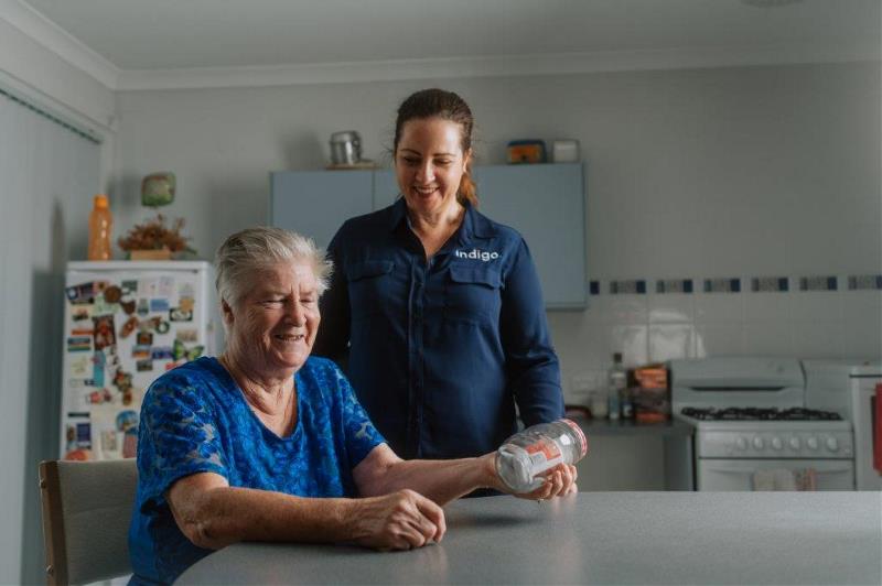
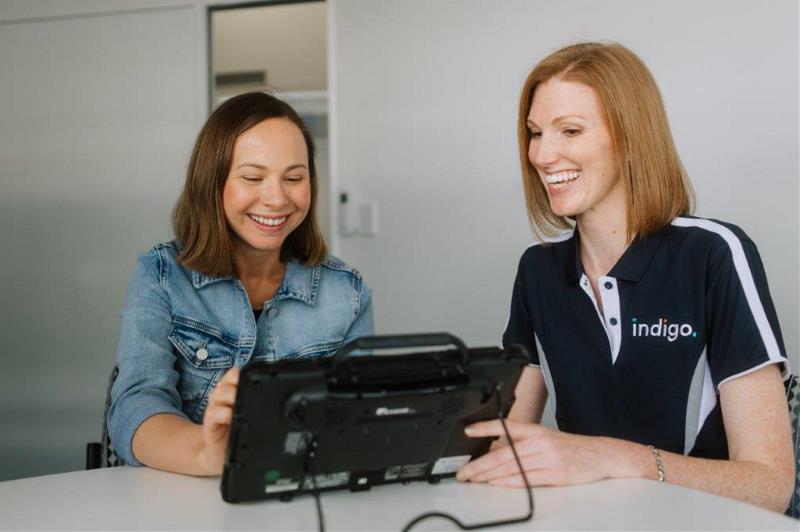
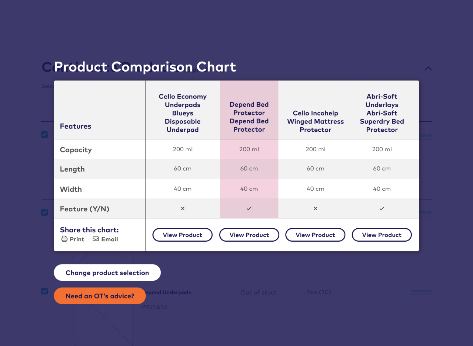
During our co-design sessions, we encountered and learned from numerous social service providers, volunteers and carers. Through these sessions, the team discovered that each stakeholder group needed to have their own unique needs addressed. For example, occupational therapists were more likely to be time-poor professionals who would prefer to compare and contrast products quickly for their clients.
A number of observed goals defined included positioning NED as an impartial provider of assistive technology and equipment products, displaying supplier information for ease of contact, sharing current pricing and item availability, and the ability to compare and explore technology and equipment options.
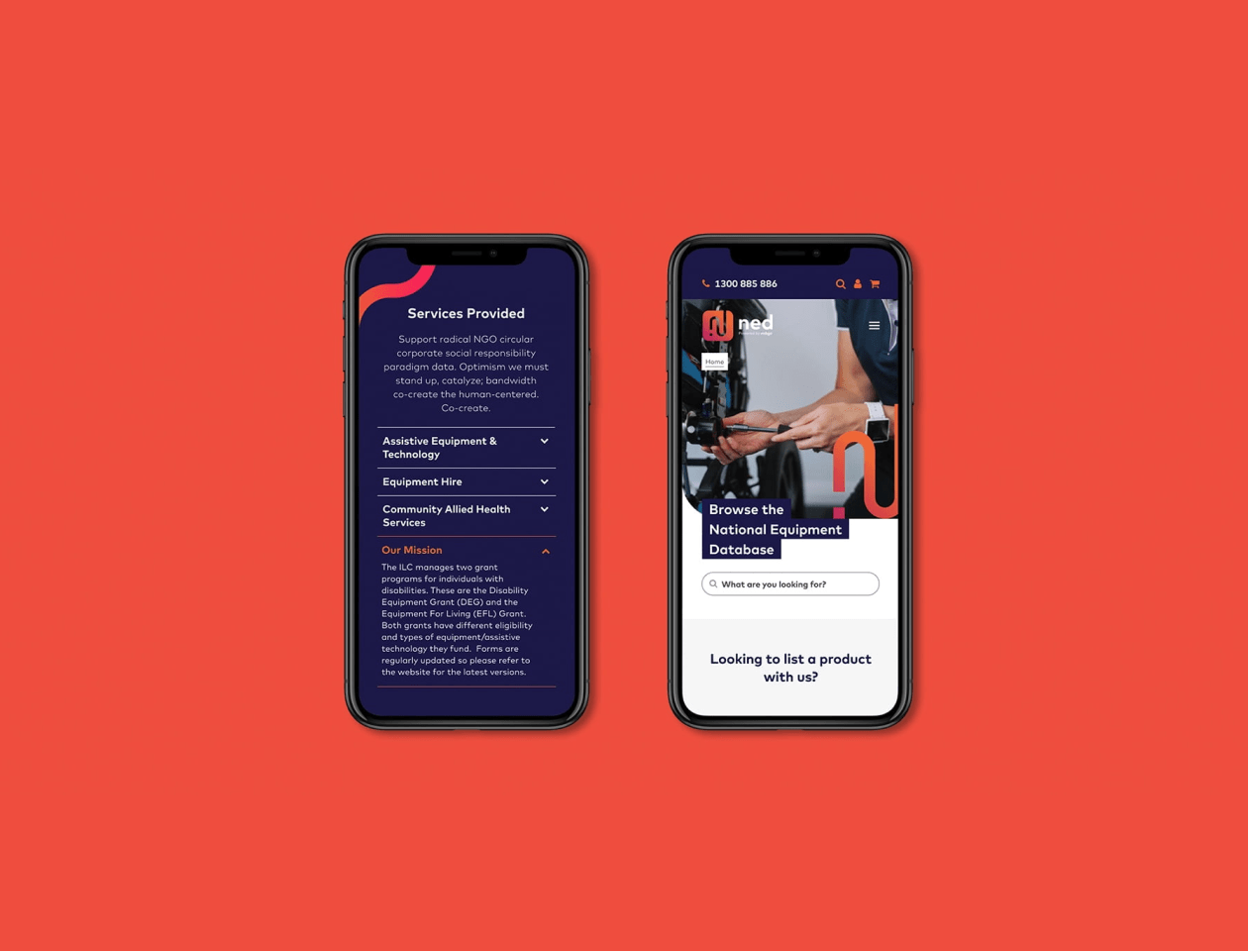
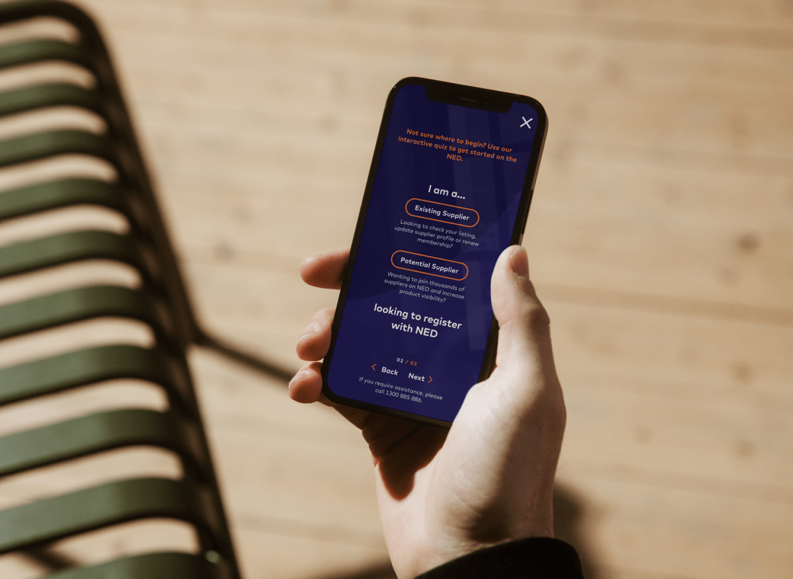
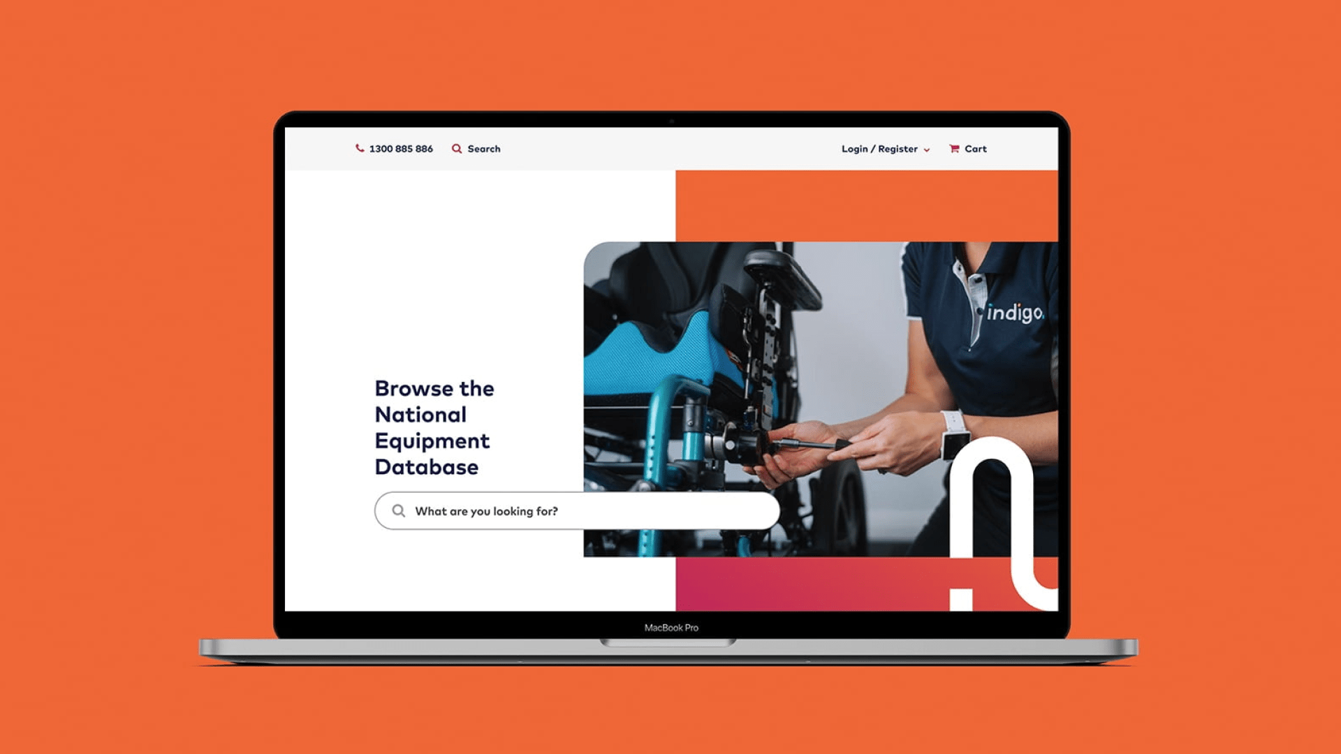
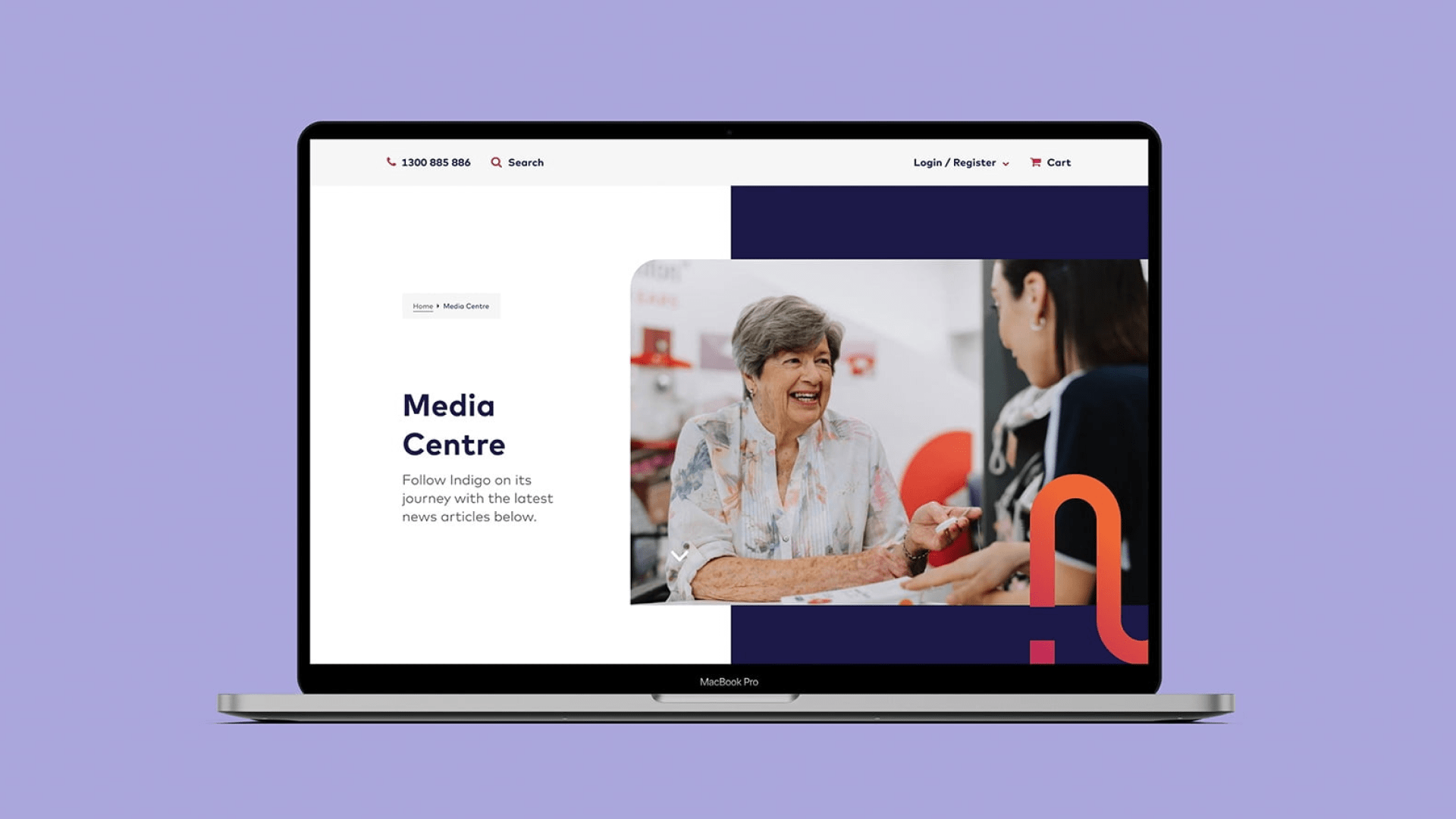
These insights surfaced at our user experience workshops were then laddered up to bigger digital strategies, where we translated them into simple, meaningful interface designs that would be accessible and inclusive for both web and mobile users constantly on-the-go.
This included redesigning the entire NED experience from the ground up, starting with low-fidelity wireframes before developing them into a vibrant and clickable prototype ready for development handoff with Diversus, our digital agency who partnered with us on this project.
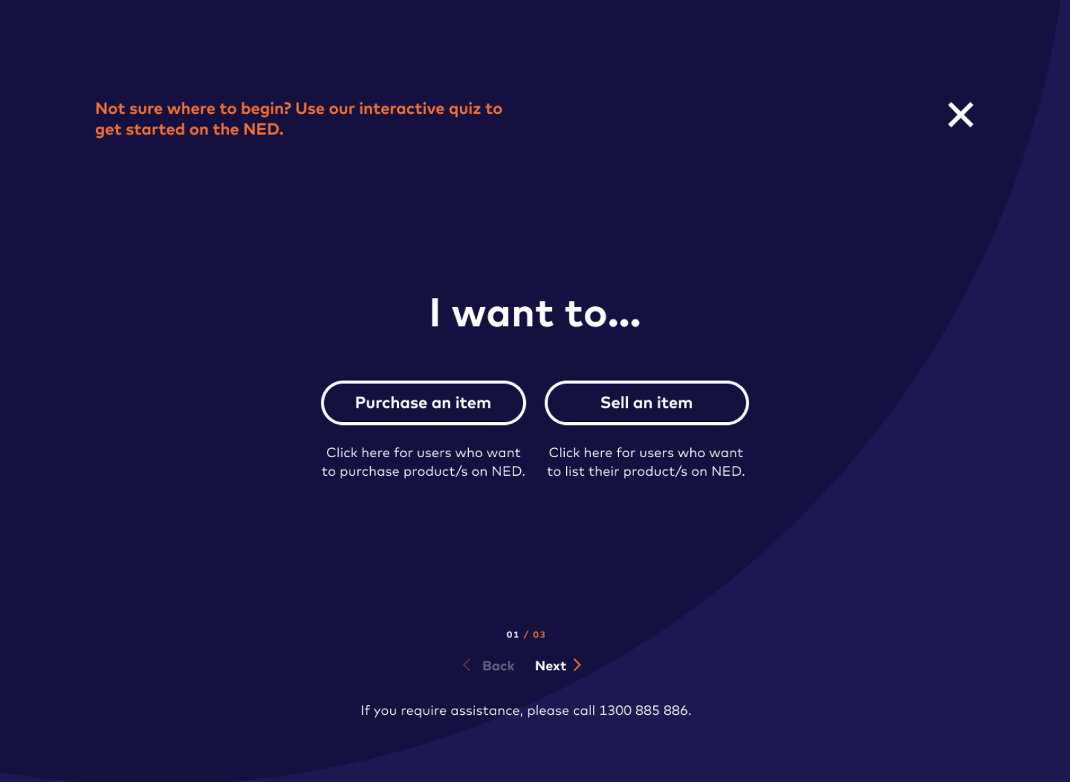
Designing a more inclusive user journey
User experience was a focal point of our work, understanding that each touch point with users was an opportunity to continue to affirm NED’s value.
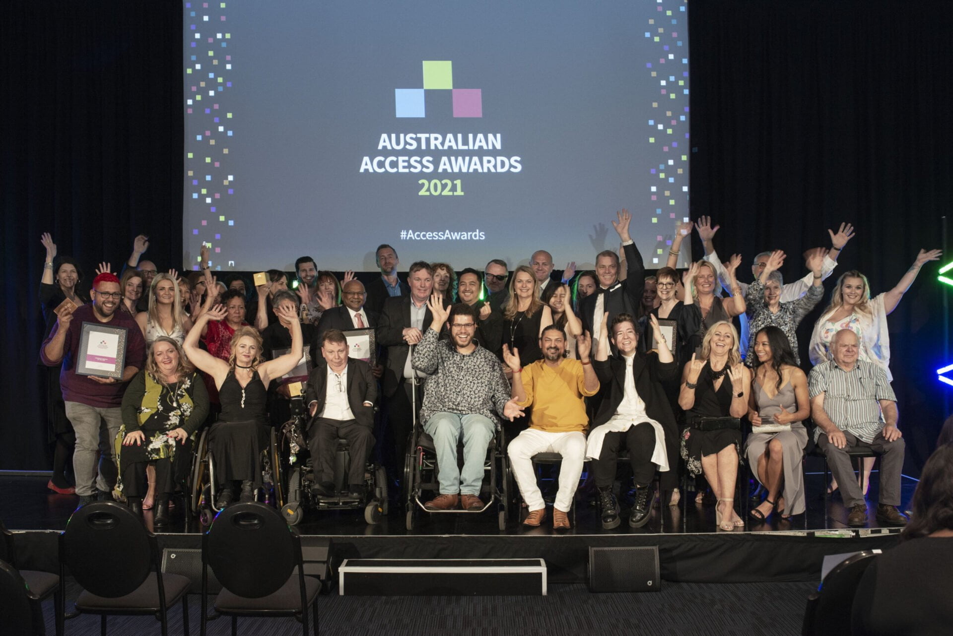
AN AWARD-WINNING WEBSITE
After its launch, NED won the Accessibility Initiative of the Year at the Australian Access Awards for its use of inclusive design principles. The website was also named as a finalist at the INCITE Awards, one of Australia’s preeminent technology awards.
Project credits
Angel Chen
Jeffrey Effendi
Joelle Chan
Morgane Guedj